
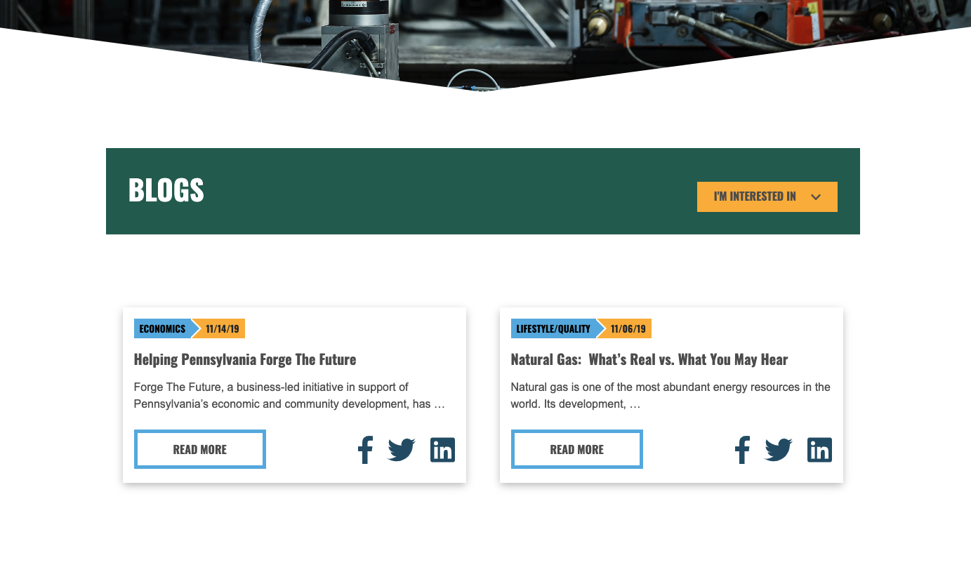
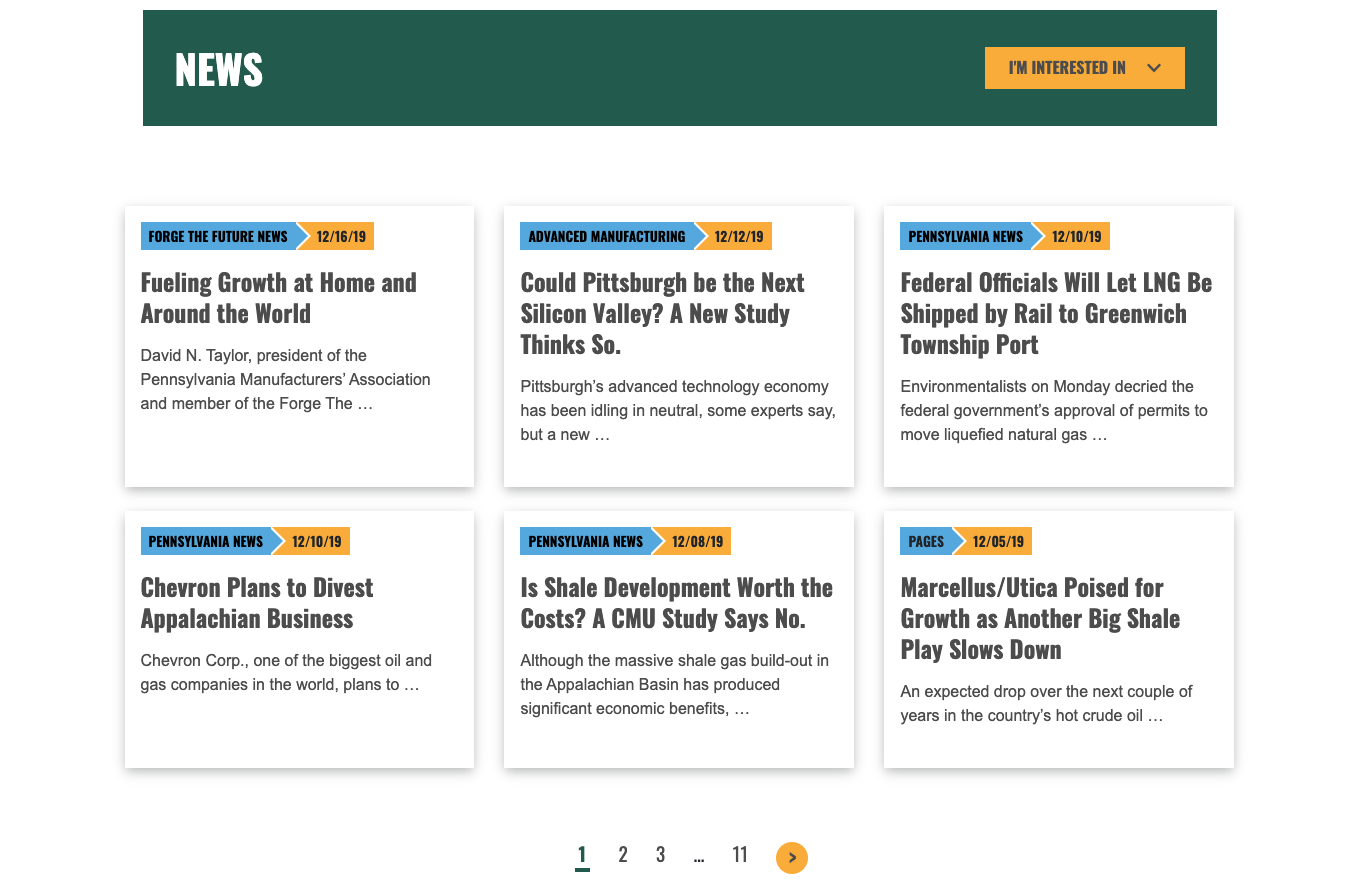
Forge the Future
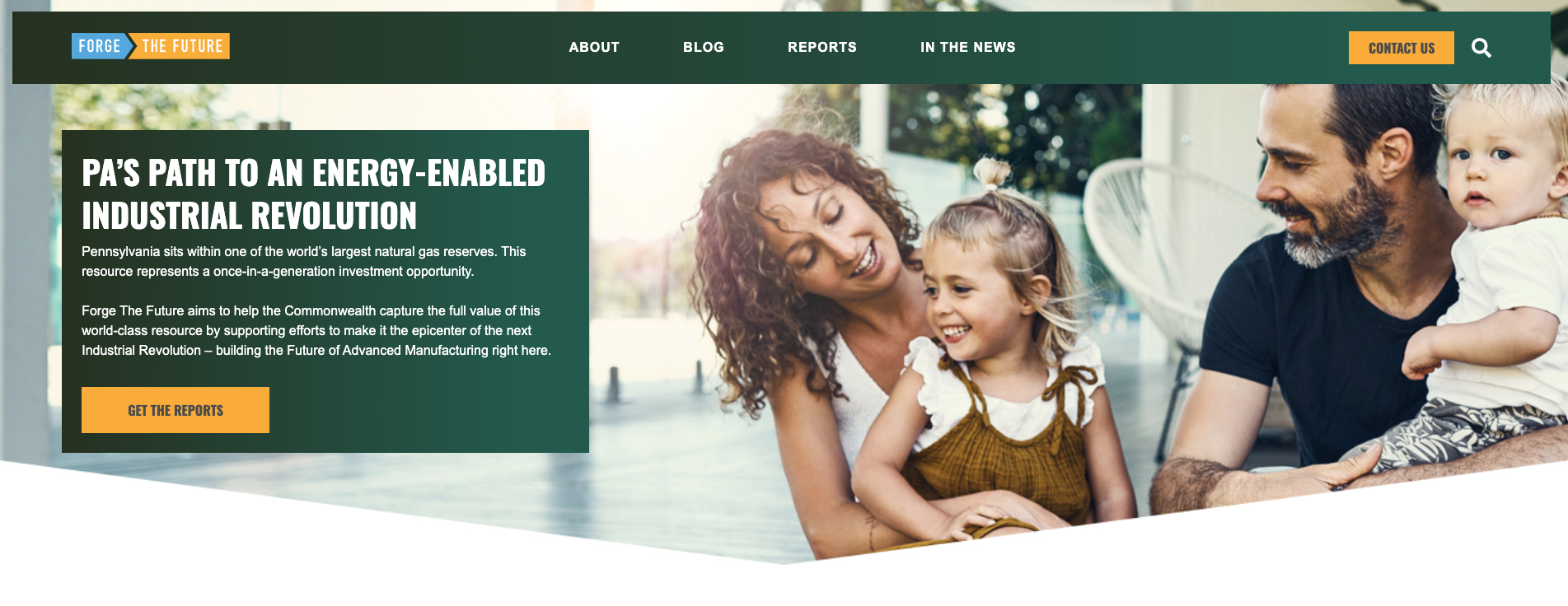
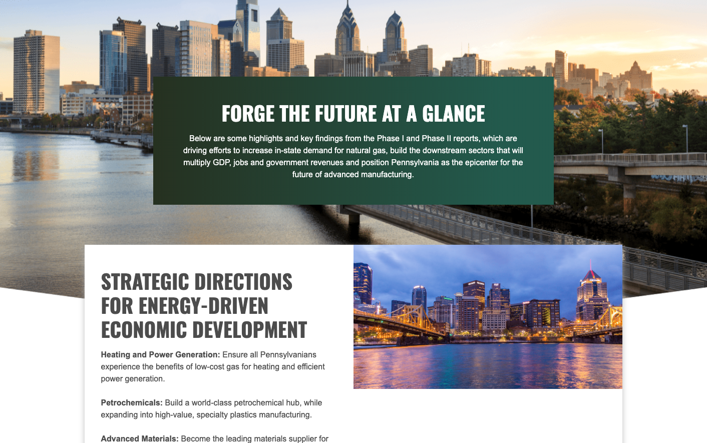
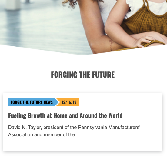
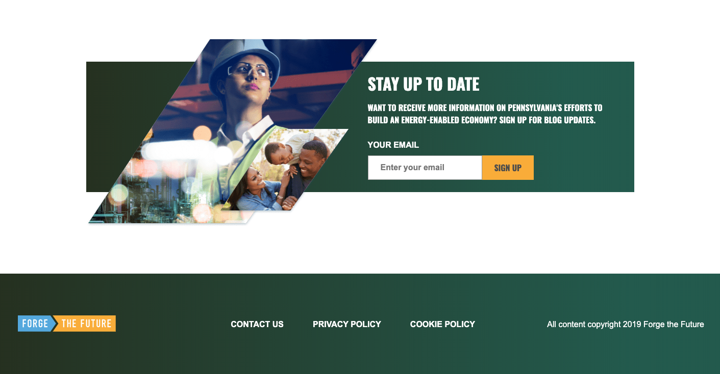
Forge the Future was a from-scratch Wordpress build using Bedrock. I worked with a designer to translate existing high-fidelity mockups into a fully-functional/responsive website.
Forge the Future was a from-scratch Wordpress build using Bedrock. I worked with a designer to translate existing high-fidelity mockups into a fully-functional/responsive website.
Specs
Wordpress
Bedrock
WP-CLI
Composer
ACF Pro Custom Fields
Wordmove
Bootstrap
Abbott Iridica Microsite
Microsite for an Abbott product named IRIDICA. As a member of the IRIDICA project team at Vodori, my responsibilities for included consulting and development in the areas of Responsive Design.
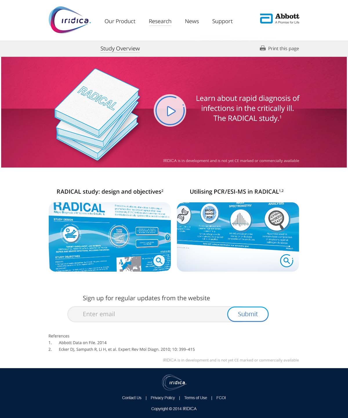
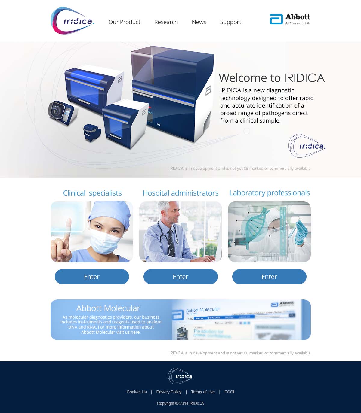
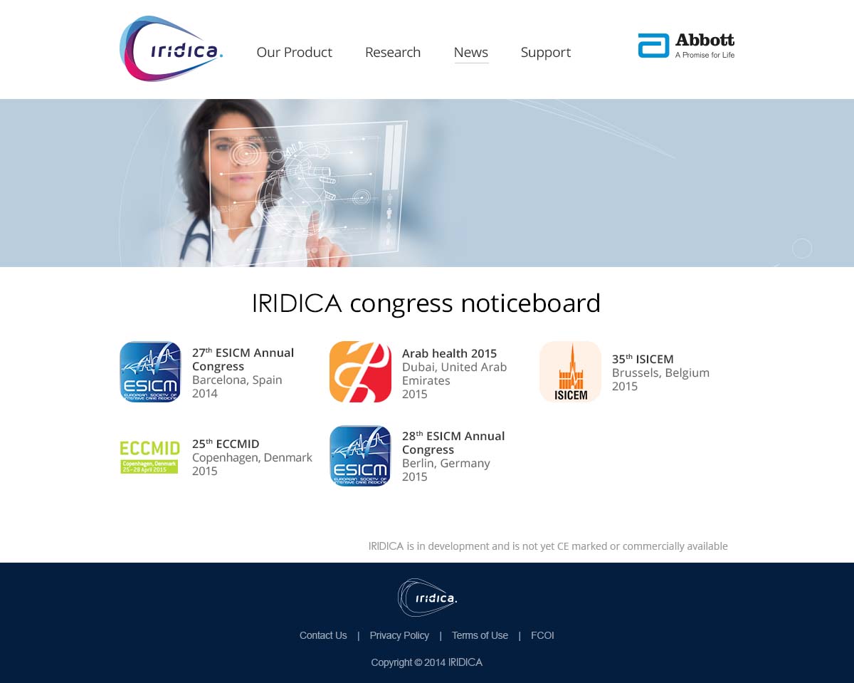
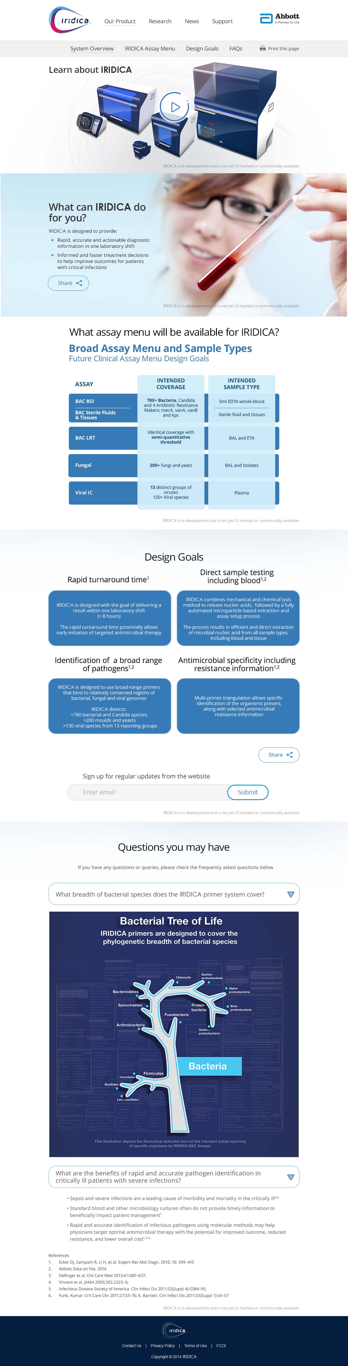
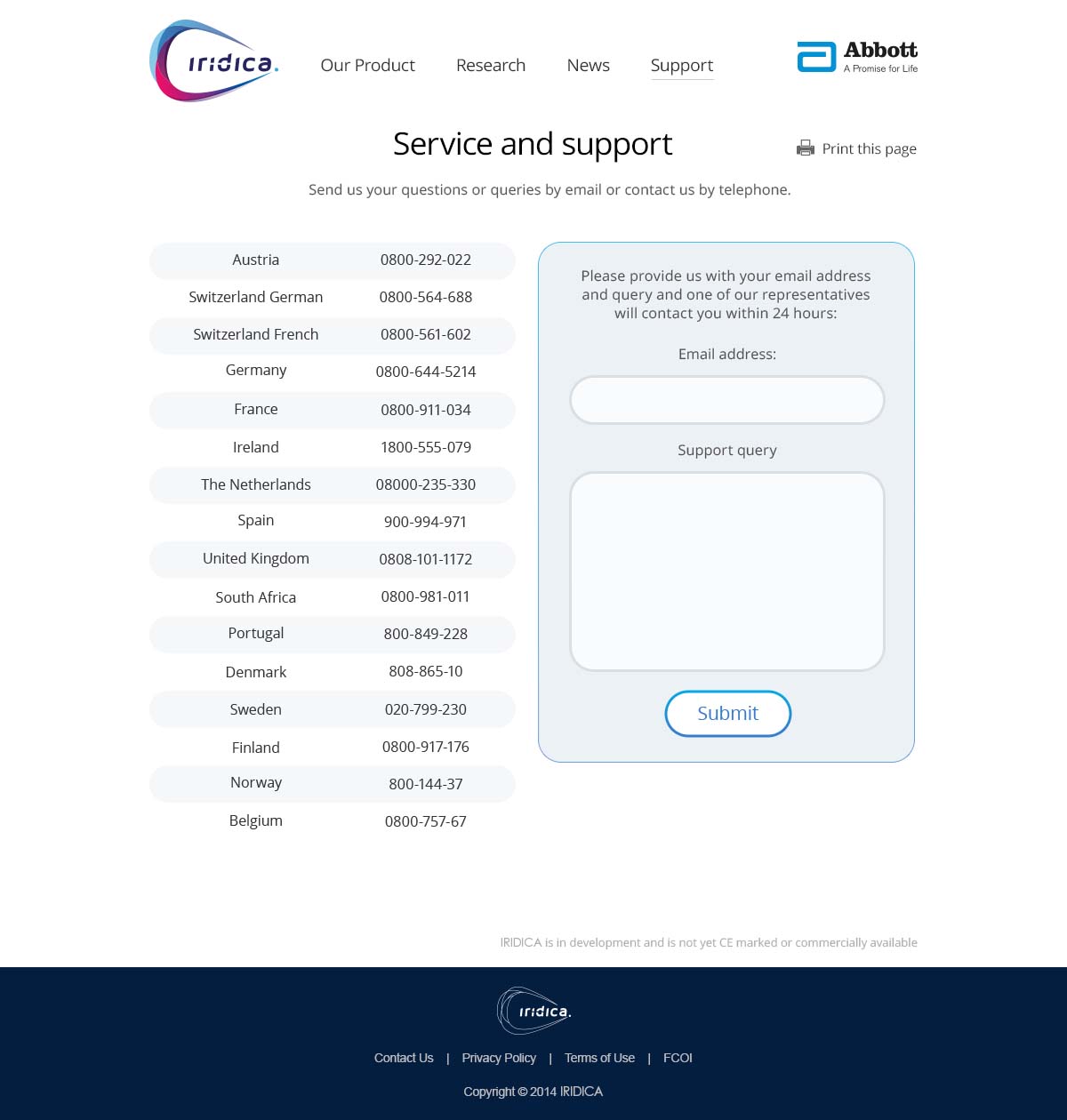
Microsite for an Abbott product named IRIDICA. As a member of the IRIDICA project team at Vodori, my responsibilities for included consulting and development in the areas of Responsive Design.

Trudo Realty
I worked directly with Trudo Realty’s CEO, brand manager, and a third-party application development agency to improve the website's fidelity to the original design and optimize the entire site for various viewports/devices.
Trudo Realty is a Chicago-based real-estate firm focused on providing service with the service-oriented motto: "people before places." I worked directly with their CEO, brand manager, and a third-party application development agency to improve the website's fidelity to the original design and optimize the entire site for various viewports/devices.
Project Scope:
UX/UI Consulting - Regular consultations with product owners on proposed UI and UX solutions based on client requests/goals
Responsive Design - Refinements to original proposed design within Photoshop and Illustrator
Prototyping - Layouts and modular components
Development - Production build-out of several templates, visual refinements, and cross-browser optimization
Digital Design - Typographic refinements and custom font implementation

MALEC
The Mid-Michigan based non-profit organization, MALEC (Michigan Alliance for Latino Education and Culture) has a clear objective: to help the upcoming Latino generation achieve career and academic success through educational programs and cultural events.

The Mid-Michigan based non-profit organization, MALEC (Michigan Alliance for Latino Education and Culture) has a clear objective: to help the upcoming Latino generation achieve career and academic success through educational programs and cultural events. An important part of achieving these goals is to effectively connect with both the current and younger generations. This need is what prompted the organization to ask for my services around communications and social media.
Website
In order for the website to be successful and for it to serve us and our audience in the best way possible, we had to go over some high-level questions first.
What is the budget/timing?
This is never a 100% comfortable topic to bring up, but it's important to establish early because it determines the manner in which we approach building the site. Budget and timing go hand in hand because they allows us to have constraints needed to build a blueprint. This being said, it's also important to think about scalability since budget may change down the road.
Since the organization was waiting on its next grant, the budget was pretty small. The timing of the site launch was also accelerated since they had an important event scheduled for about 2 months out. This meant that if we wanted to promote the event on the site, we needed it completed in no more than one month.
Who uses it?
The objectives are closely related to the actions of parents, educators, and potential donors. This meant it was important for the website to be easy to use for the age group of about 30-50 years old. This demographic is important to distinguish because it drives the decisions on the UX design. More specifically, it would be important to maintain common user conventions to give this age group an experience that they are familiar with.

Image Credit: webusabilitytalk.com
What are their goals?
After some brainstorming, we determined that the goal of the user would be to find information quickly and easily understand the goals of the organization. A secondary goal would be to easily contact MALEC with questions.
What is the primary function of the website?
An important goal for MALEC was to create a presence that would encourage visitors to make donations. MALEC is a non-profit, so they rely heavily on tax-deductable donations for covering operating costs. While this was important, I advised them to not make this call-to-action weight as much as the value of their programming and events. My advice to them was that if you provide value to the community, the donations won't need much of a call-to-action.
MALEC also wanted the website to be the home base of information for their organization. The primary content that was determined to be the most important for MALEC's audience was event information, social media activity, founders and Board of Directors information, and mission statement.
Overall, they wanted the website to be part of establishing credibility with the community and effectively communicating the organization's goals while enticing potential donors.
How do we measure success for the website?
The organization was preparing for a big event during the initial discussions about the website. The primary way for us to know if our efforts for the website was successful was by viewing the analytics of our "events' section. The strategy MALEC wanted to implement would funnel users to the "events" section to get information about the upcoming event. If we made it easy for them to get there, we would see relatively equal numbers of pages hits between the "home" and "events" page.
Another part of success that is an internal goal is to write content consistently. Whether it's in the form of a blog or social media posts that get pulled into the website through an API, posting relevant, valuable content regularly is part of our success criteria.
What types of things are users doing on the site?

Image Credit: http://www.netsolutionsindia.com/
In our discussions, we imagined what types of actions the user would be doing on the site. Reading, browsing photo galleries and using the contact form were the top three predicted user activities.
What is the user thinking when they are on your site?

Image Credit: http://www.inspireux.com/
Talking through what goes through the mind of a user is very important to creating a good UX (user experience).
We thought about how important it would be to show that the organization is plugged into the community through social media. Widgets that show our activity on Twitter would be a good way to communicate this in a subliminal way.
Another important piece of user behavior is mobile device browsing. The website would need to be optimized for mobile devices since mobile traffic has now officially exceeded desktop usage across the board! This exercise served as a high-level roadmap to what types of functionality the website would need and would help us in choosing a platform.
Who is keeping the site up to date?
It was important for the MALEC staff to be able to update the site at any given time. This meant that the CMS (content management system) we choose needed to be easy to use.
Which CMS to use?
When we had this conversation, it was beneficial for us to list the requirements.
readable type
photo galleries
forms
optimized for mobile devices
payment system to accept donations
blog functionality
social media widgets
Off all the possible choices, we determined that Squarespace would be the most appropriate CMS to use. Not only did Squarespace fulfill all the requirements, but also has some additional perks.
domain name management
free customer service
low price point
beautiful templates that are responsive out of the box
basic-level analytics built in
Process
Gathering Content
The first step was to wrangle in all the content that we needed to put on the site. It was a combination of word documents and google docs.
We were finding that the process of sending documents via email and dropbox was getting quite messy. It was time to figure out a better process of organizing this content!

Enter Slack!
Slack was an excellent solution for storing all of our files in one place and being able to communicate in real time. We could write notes about the pieces of content and share them in many different ways all without needing email! A workflow win.

Slack uses "channels" to keep conversations and files organized. We ended up using two channels, one for website specific content and the other for the planning of their upcoming event. Naturally, there was some overlap since we needed to include information on the event on the website as well. This is where the "sharing across channels" feature became very useful!
Information Architecture
Now that we have our content, we need to decide where it goes! We discussed the hierarchy of importance when it came to the content. Which content was most important for people to see right away, which was less important.
Pages
We discussed how the names of pages should be easy for the demographic to recognize and know what they are right away. "Home", "About", "Contact" and "Events" ended up being the names of all four pages of the site. While I'm not always an advocate for using "home" in a navigation menu since logos as a convention usually link back to the home page and the extra "home is not needed, I suggested that we use "home" in the navigation menu since the audience is between the ages of 30-50 and are more accustomed to this convention.
We also decided to highlight the page "events" since we wanted to draw attention to their upcoming event. Squarespace had a functionality built-in that would allow us to make that navigation item, "featured" which ended up putting a rounded border around it. This ended up being a perfect way to bring attention to it without being too glaring.
Home Page
It was important to spell out the name of the organization straight away to plant the seed early. We needed a couple of sentences that would communicate the message quickly and effectively. We had a lot more to say which warranted the "learn more" call to action button, which would lead the user to a more granular narrative about MALEC's mission.

News
We wanted to have a feed of news posts on the homepage, but we didn't want the entire article to be displayed to preserve screen real-estate.
After discussing what types of content we thought our audience would be the most interested in, we decided that the content of news posts would be event updates, industry-related articles written by MALEC, or press clippings.

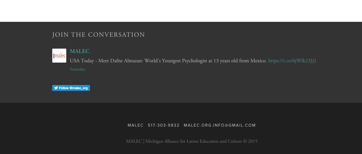
Social Media Widget
Based on our audience, we wanted to show that we had a presence on Twitter. Again, we didn't want to take up too much screen space and overstate our social media engagements, so we opted to use Squarespace's social media widget which pulls in data from your account and displays any desired amount of tweets. We wanted to display one tweet at a time.
Masthead Imagery
We knew that choosing the right imagery to convey the culture and education goals would be important. We wanted the user to glance at the imagery and text and just "get it" right away. So we choose an image from a Dia de los Muertos celebration shot by Robert Killips (one of the MALEC founders) to use for the home page masthead. We felt the word "culture" in the heading paired with the image of the performers with sugar skull makeup would convey the message immediately.

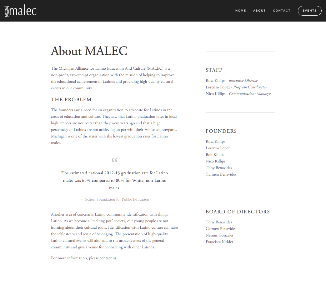
About Us
We talked about the hierarchy of importance for the about us page. We knew it would be important to go into more detail about MALEC's mission and to list the founders and board of directors. Once we places those elements on the page, we realized that we didn't need to go any further as these elements provide the most value for the user.
Contact
Squarespace has a form widget that allows you to customize your form in very useful ways. We needed a form with the usual fields (again, back to sticking with normal user conventions to keep the audience comfortable). Naming the form and adding or subtracting fields is a breeze.

When building a custom form from scratch, configuring it to send to an email address is not difficult. However the security measures and form validation are a little more tricky, especially across multiple browsers. Squarespace handles both out of the box! As an added bonus, there is an API built-in to connect to Google Docs and MailChimp!

An aspect of forms that is often overlooked is the post-submit message. By default, Squarespace populates, "Thank you." This is adequate, but we wanted something a little more customized. Again, Squarespace makes it simple to modify the message the user receives after submitting the form.

The last piece of the contact page we wanted to implement was an email list sign up. This is another case of looking back at our audience. Our age 30-50 group is very likely to still use email very heavily, which makes having an email list signup form important!
We wanted to ensure that our audience would trust us not to spam them, so we decided to be transparent about what our intentions were for collecting their information.

Events
The goals of the events page were to describe the types of events that MALEC strives to create and eventually, once we had enough events under our belt, display an archive of past events. Since the organization was embarking on their first event, it made sense for us to display the information about the event on the events page.
Once the event was over, we created an event summary post which lived outside of the "/events" page as its own news post. We did this so that we could bring it in later as an archived item.
On the "/events" page, we wrote a summation statement about the event and created a call-to-action to forward users to the more detailed summary of the event (the news post.)

The events page, after the conclusion of the event. (http://www.malec-mi.org/events/)
Event Summary Post
MALEC thought it would be important to thank everyone involved with putting on the event, and the community for their participation. In addition, they wanted to let people know that they planned on holding more cultural events in the future.
We added a photo gallery of the event to let users reflect on the experience.

The event summary post. (http://www.malec-mi.org/news/2015/11/19/dearly-departed-event-summary)
Conclusion
The Squarespace platform allowed for us to get the site stood up within two weeks, which was enough time for us to craft a social media strategy, of which the website played a very important role. The website also served as a warm introduction to the Mid-Michigan Latino cultural and education communities.
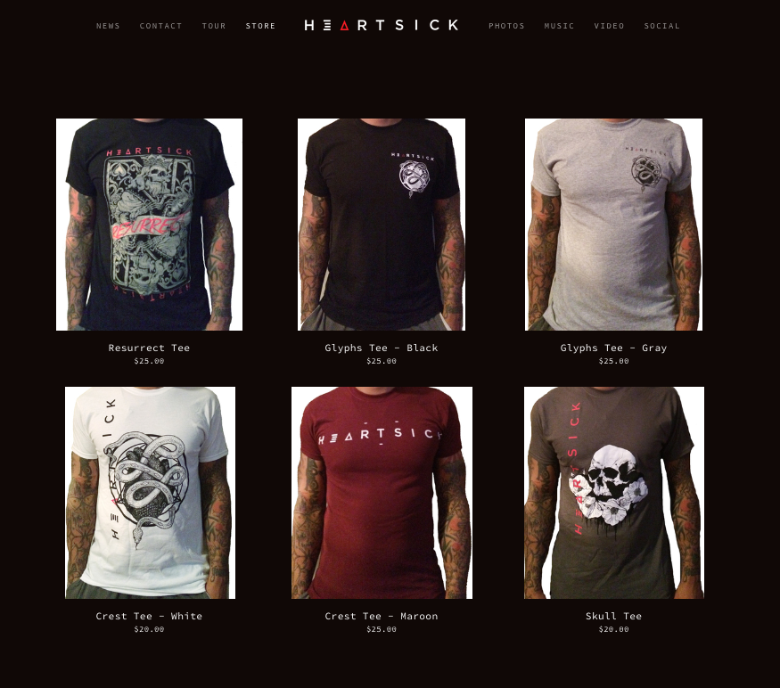
Heartsick Website
Heartsick is a regional touring metal band from Lansing, MI. Our consultation yielded specific goals, and a plan for how to implement various systems to achieve them based on a number of factors.

The regional touring metal band from Lansing, MI needed a web presence that could establish credibility in the music industry and engage their fans. In our consultation, we came up with very specific goals for the website:
Goals
Give fans easy access to important content
We talked about what content fans would need to be able to access quickly. This content included:
Details about the newest show
Details about events of interest
Where to purchase merchandise
The website should be easy to manage
Heartsick expressed the concern about being able to keep the site updated regularly. They wanted to be able to add blog posts, add images, galleries, and video quickly and easily. This meant we needed to choose the correct platform.
More than just “Mobile Friendly”
Being a band and a business for nearly 15 years, Heartsick was aware of the importance of mobile engagement from their fanbase. This meant that we needed to take responsive design and development into consideration when choosing a platform.
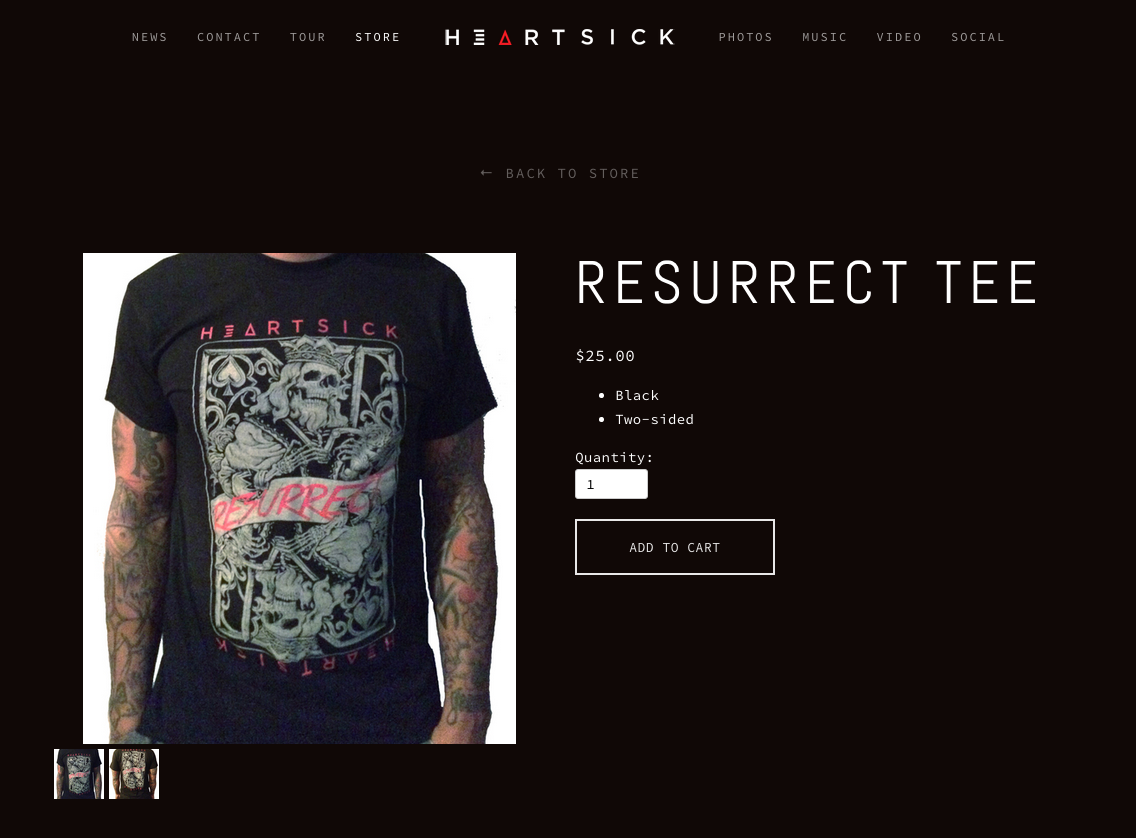
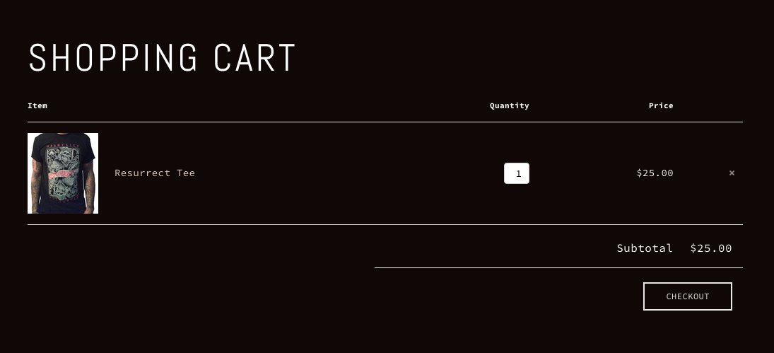
Provide a great eCommerce experience
DIY bands like Heartsick rely on merchandise sales. It is the one of the few sources of revenue that has a controllable profit margin. Given the importance of merchandise sales, the online checkout experience needed to be as seamless and simple as possible for their customers.
Visible engagement metrics
The band had asked about ways to implement various “counters” of likes, shares, and other forms of engagement metrics. We wanted to make sure their website had these tools because it was important to show that the band was active on social media. Not only was this a great way to help instill confidence in their followers and potential fans, it was also a great way to show potential investors, record executives, and other industry professionals raw numbers at a glance.
Solutions
The Squarespace Platform
We decided on Squarespace as the platform of choice based on a number of factors including; project budget, CMS (content management system) specifications, and product price point.
Managing Shows
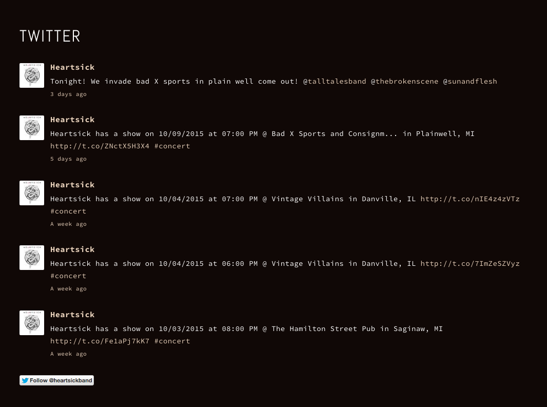
Heartsick was accustomed to managing their tour dates through the "Bandsintown" app. Squarespace provides an API widget that pulls show data from an existing Bandsintown account and gets styled by the template.
To allow the band to promote their next show, we set up an editable region on the home page. This allowed Heartsick to add promotional flyers and customized calls to action.
News Section
It was important to highlight important previous and upcoming events.
Squarespace's blog component was a simple solution to displaying a collection of events. The blog component (or "collection" as it is referred to in Squarespace) is designed in a way that is easy to add posts, set post dates, assign featured images (they show up as thumbnails in a grid) and change the way the collection is displayed (you can choose between a carousel, grid, wall, or list view).
Galleries
Heartsick needed a way to implement multiple photo galleries, and also a way to reuse them on other parts of the site. (E.G. The band would include a photo gallery for a specific event post, but would also want to add it to the photography page) Squarespace's "collection" feature allows the user to create a collection that can be used anywhere on the site. When the user modifies the "collection" to remove or add a photo, the "collection" is updated everywhere.
Online Store
Squarespace's built in checkout process is designed to get the user to the end of the process as quickly as possible, without adding confusion. The process of getting the band's debit card and checking account linked was very simple and fast.
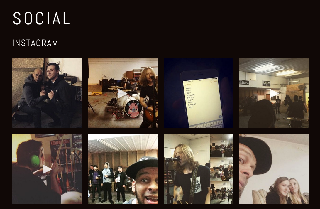
Social Media
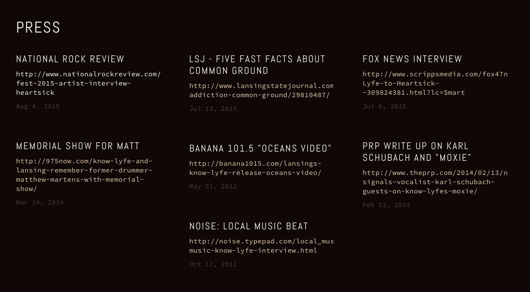
Displaying social media activity was a breeze using Squarespace's social media widgets. Connecting Instagram, Twitter, and Facebook was a simple process. In addition to social media widgets, they needed a section for press clippings. We simply created a new "collection" which was composed of individual "posts" (press clippings with links to their respective source).
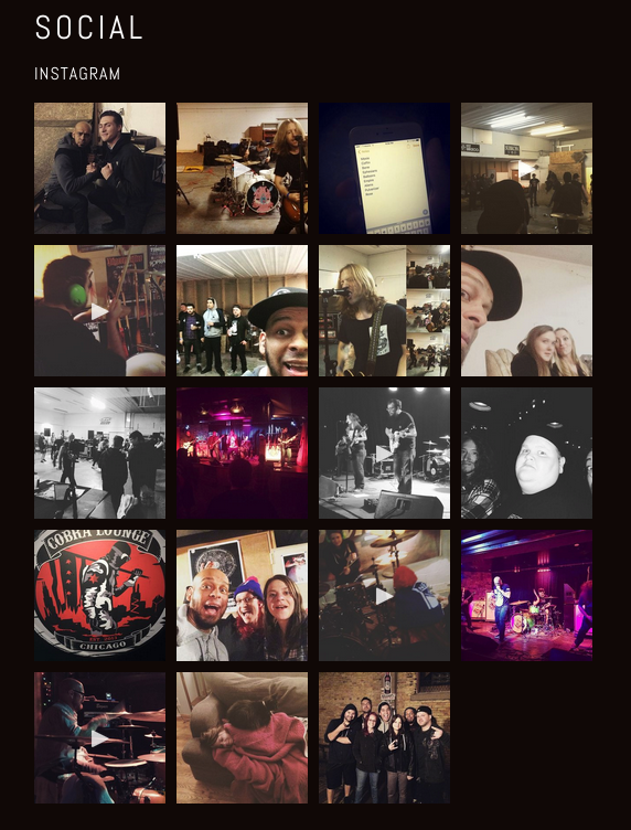
Workflow Automation with IFTTT
In addition to displaying customized widgets for their social media outlets, we also came up with a solution for streamlining Heartsick's social media sharing. Enter: IFTTT!
We set up different "recipes" that will trigger various actions across multiple social media platforms. An example of a "recipe": when Heartsick uploads a video to Instagram, it automatically gets shared on their Twitter and Facebook account. This way, all audiences are able to interact with their content.
Another way we used IFTTT was to automate the social media photography archiving process. We connected a Dropbox account and created a "recipe" that would save any newly tagged photos of Heartsick into a Dropbox folder.


Life Fitness
The Life Fitness team leveraged my past experience as a UI and Responsive Designer and consulted with me regularly during the interactive prototyping phase on solving UI Design-related problems.

Image Credit: Tyler Kamigaki
While working at Vodori, I was one of a handful of front-end developers to work on the redesign of Life Fitness.com. While technically my role was "front-end developer", I ended up being involved in many different facets of the project.
Our collective goal was to deliver a redesigned site that would tell Life Fitness' brand story through rich imagery, carefully crafted content, and a delightful/intuitive UX.
UI Design

Image Credit: Tyler Kamigaki
Vodori and the Life Fitness team leveraged my past experience as a UI and Responsive Designer/Developer and consulted with me regularly during the interactive prototyping phase to solve complex UI problems.
I helped craft strategies and solutions for handling complex layouts and how they respond to a massive range of devices and environments.
Front End Development

Image Credit: Tyler Kamigaki
Webflow
Our team leveraged Webflow to create the interactive designs/prototypes. As an exercise to potentially save on time and budget, we opted to bring in Webflow's CSS/HTML into our production app code, going through phases of code parsing and purging. We learned a lot about this, which you can read more about here on my Codepen blog post.
CSS/LESS Development
While this was the first large-scale app I've contributed to, I was still able to implement code/practices that I've learned throughout the years.
Since this was such a large app, I knew it would be important to utilize Object Oriented CSS as often as possible. I was able to do this through creating design objects and patterns.
Handling Images and Focal Points
A large hurdle our team had to overcome was how to handle the changing aspect ratios of images across many viewports. Keeping the focal point in the center of our photography was very important in that they were part of telling the brand story.
The large challenge we faced was that in many contexts, we were forced to use the <img> tag, which restricted us from using the css property: background-size. This forced us to apply custom positioning with media query breakpoints to keep the focal point in the center.
We were able to modularize the set of positioning rules mapped to media query breakpoints so that applying them in various contexts would be simple and fast to implement.

Vodori
During my first year at Vodori, the powerhouse SAAS agency embarked on a redesign of their website. I was asked to aid with the responsive strategy and front-end development.

Image Credit: Tyler Kamigaki
Vodori is a SAAS (software as a service) company in Chicago, IL that specializes in digital marketing, data/asset management, and asset workflow through their in-house flagship platform called Pepper.
I was fortunate to work for Vodori for nearly two years, where I served as a front-end developer and responsive design consultant.
During my first year at Vodori, they embarked on a redesign of their website. I was asked to aid with the responsive strategy and front-end development.
Design

Image Credit: Tyler Kamigaki
I worked closely with the brilliant web designer, Tyler Kamigaki on implementing his design for the new vodori.com.
We worked together taking his static mockups into an interactive prototype by designing in the browser in Chrome Dev Tools, refining typography, layout, and content iteratively. All while creating design patterns and modularizing the code.
Code
This site was implemented as a static site using PHP. We used LESS as the CSS preprocessor and Wordpress for the blog component.
We experimented with creating media query objects in LESS (a blog post I wrote while working at Vodori) so that we could apply them easily throughout the project.
NOTE: Vodori has redesigned their website to align with their new brand direction since the original authoring of this post (Oct 12, 2015). The images and descriptions of Vodori do not reflect their current brand.
Tamarack Camps
This premiere Jewish Youth Camp facility had the goal of creating a website that appealed to the age 12-18 demographic while reinforcing their decades of excellent programming and service to parents.
This premiere Jewish Youth Camp facility had the goal of creating a website that appealed to the age 12-18 demographic while reinforcing their decades of excellent programming and service to parents. Alongside the brilliant Carl Winans and Oceanvue, we struck the balance of those two specs by utilizing large, colorful buttons and playful typefaces to catch the eye of the younger audience, and incorporating various jQuery elements (such as accordions and tabs) to display large amounts of content in a functional way.
My Role
I was given the task of turning a photoshop design into a fully functional Wordpress theme. The challenge was implementing advanced functionality and involved design composition, with small development budget.
Process
We decided to utilize a Wordpress theme from themeforest.net that would be easy to skin, and already had the advanced functionality built-in to the theme.
Challenges
"Camp Begins" counter.

Tamarack expressed the need to display a widget that would show how many days are left until their camp season begins. We tried many Wordpress widgets, but they were quite bloated and did not allow for enough customization. We ended up writing our own PHP function that we could easily modify and display on any part of the site.
Handling large amounts of content on a single page
We had to come up with solutions for displaying large amounts of content on a single page. The solution needed to be simple enough for the Tamarack staff, of whom had varying levels of content-authoring expertise.
We ended up using a shortcode plugin called Tabsy that would generate tabs on demand through declarative markup. This solution required very little training and was an effective way to fit large amounts of content on a page.
Technology
Wordpress, PHP, JQuery, HTML5, CSS3

AMA Insurance
As part of a large project team in Chicago, I directly contributed to the front-end code of amainsure.com which was part of a larger rebranding campaign.
Scope of Work
As part of a large project team in Chicago, I directly contributed to the front-end code of amainsure.com which was part of a larger rebranding campaign.
Direct Contributions
Mustache templating system implementation
HTML, CSS, LESS
Responsive Design / Development